Capitol Hill Tool Library is a volunteer-driven organization that makes tools accessible to the local community. I worked closely with staff and volunteers, designing a user-friendly website that simplifies complex workflows.
Designing for Capitol Hill Tool Library meant balancing simplicity with functionality. Volunteers need to move quickly, but the system also handles complex tasks like inventory tracking and member management.
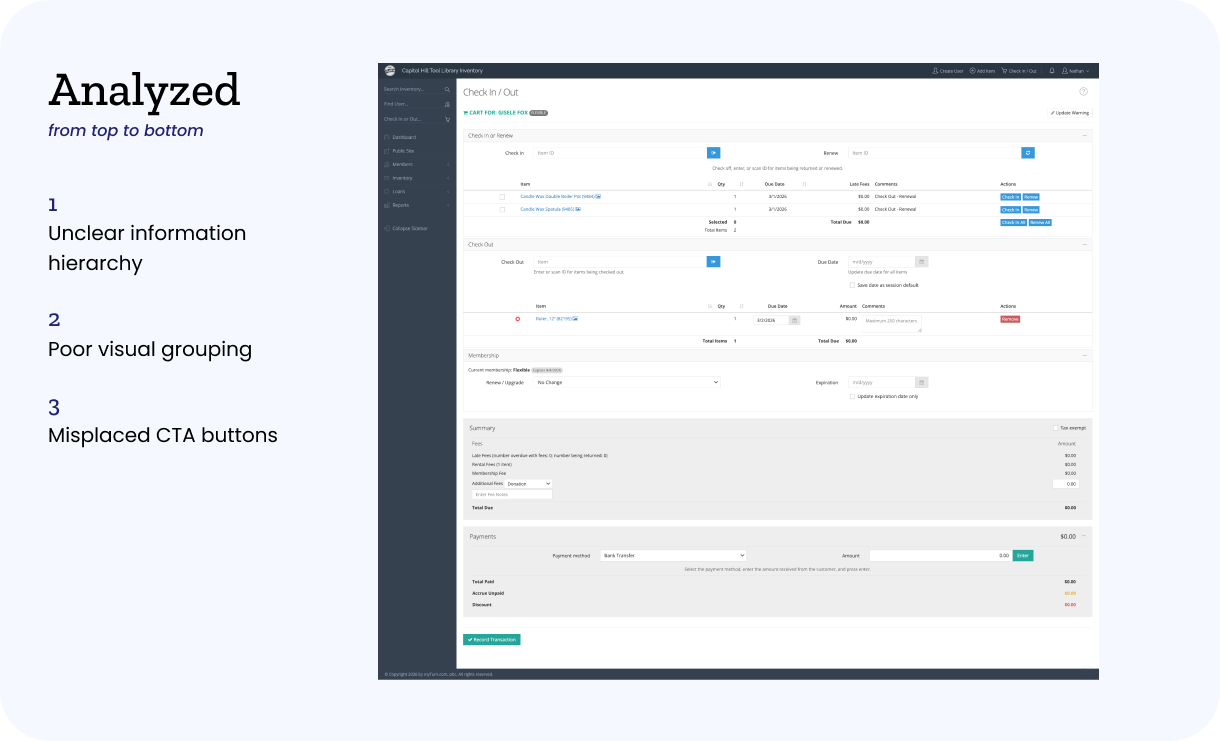
Another challenge was designing for inconsistent users. Unlike typical products, users are not frequent or trained. Many interact with the system for the first time during a shift, meaning the design must be immediately understandable.
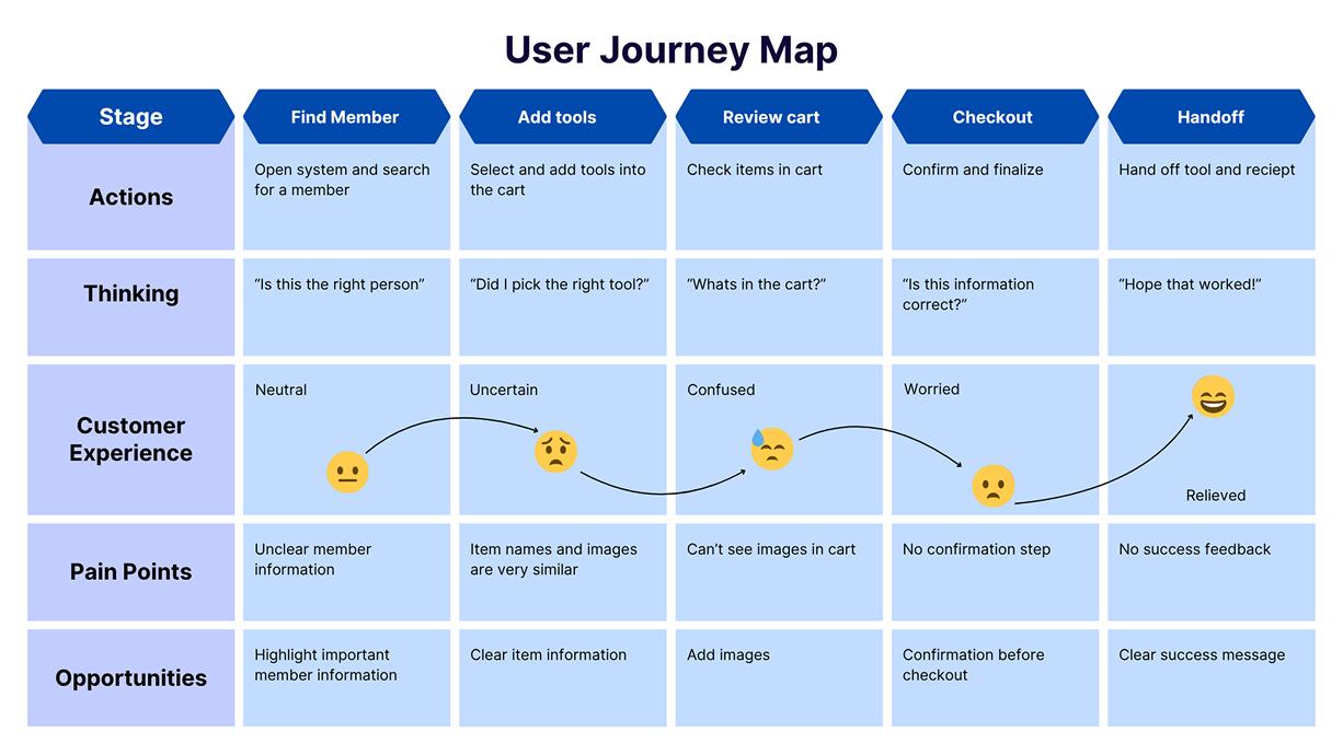
We conducted user interviews and volunteered at the tool library to understand the workflow firsthand. Based on these insights, we created personas, user journeys, user stories, and site maps.
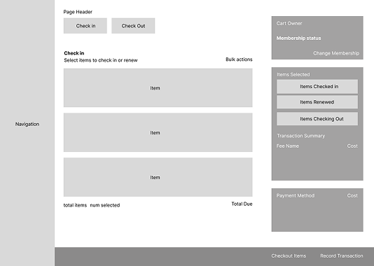
After studying and researching other tool libraries, we created multiple wireframes with different structures based on our research and user studies.
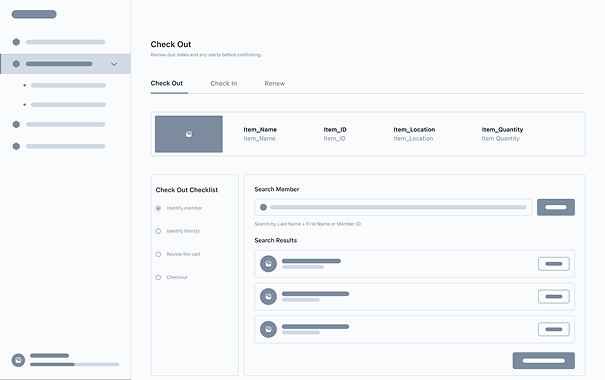
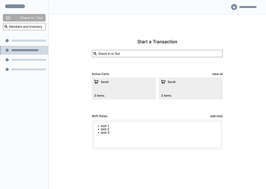
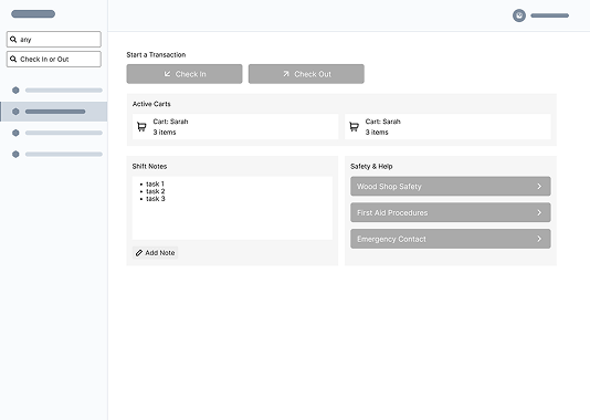
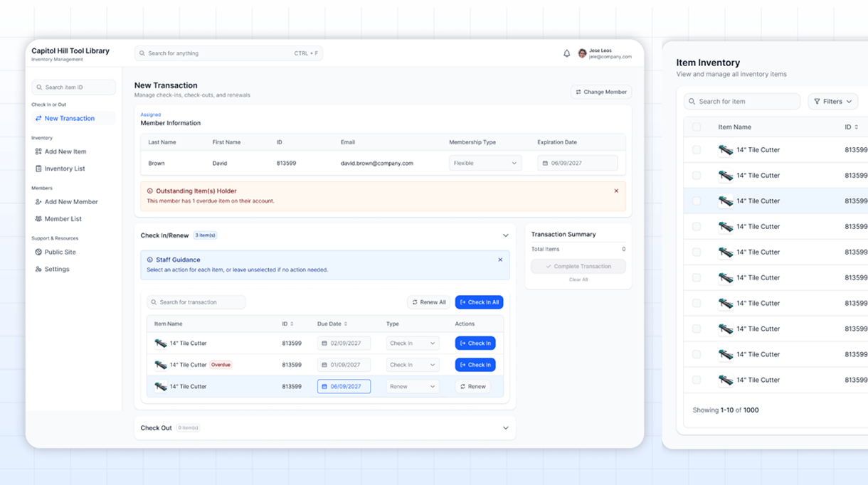
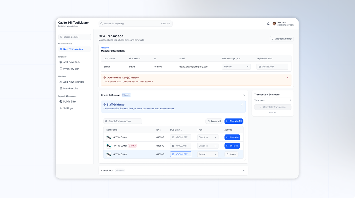
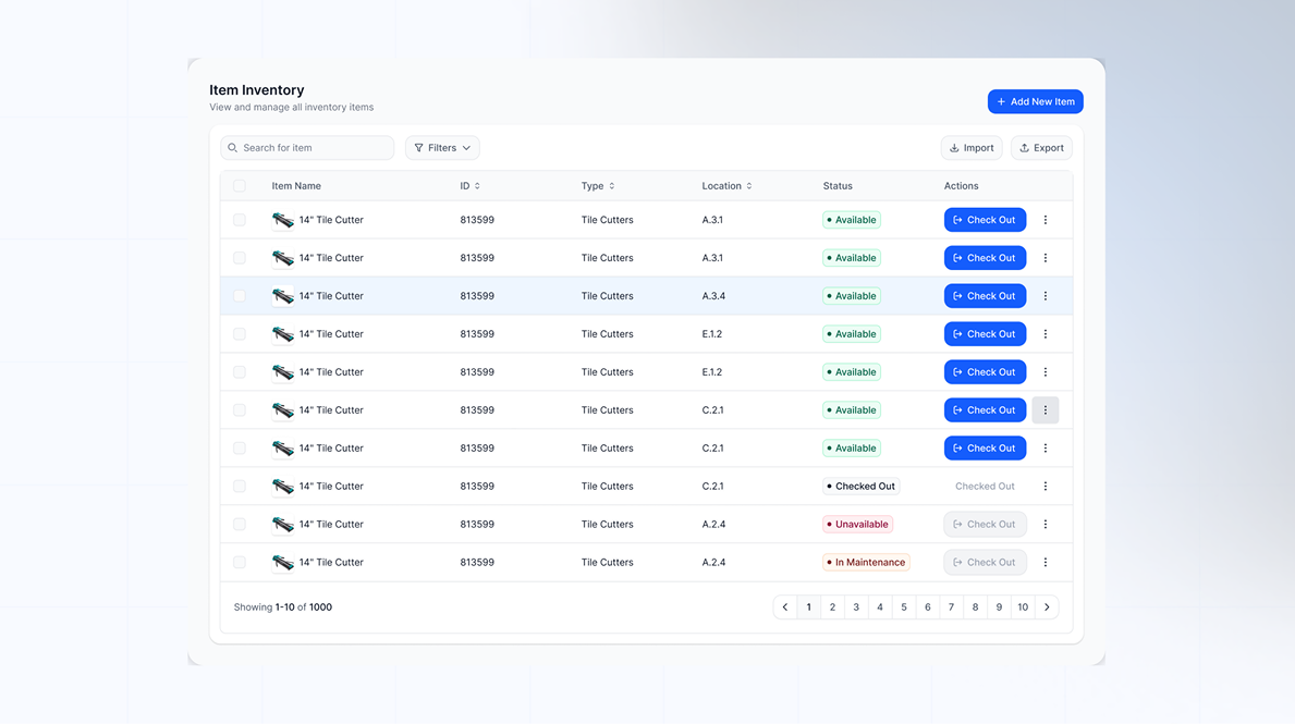
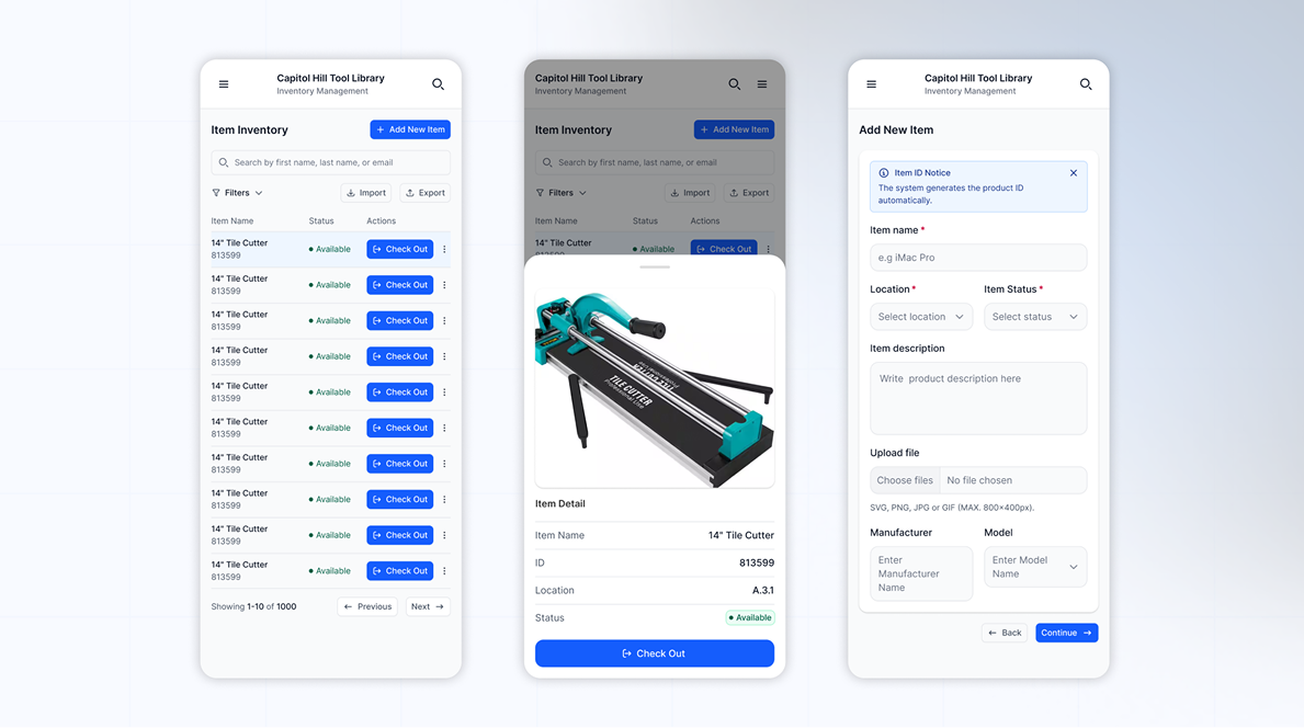
I designed and prototyped the check-in and check-out workflow for the Capitol Hill Tool Library system in Figma. I focused on creating a clear visual hierarchy that would guide volunteers through each step of the process, especially in a fast-paced environment. Instead of using bright or distracting elements, I prioritized clarity and readability by emphasizing primary actions and reducing unnecessary visual noise. This resulted in a more focused interface that helps users complete tasks quickly without feeling overwhelmed.
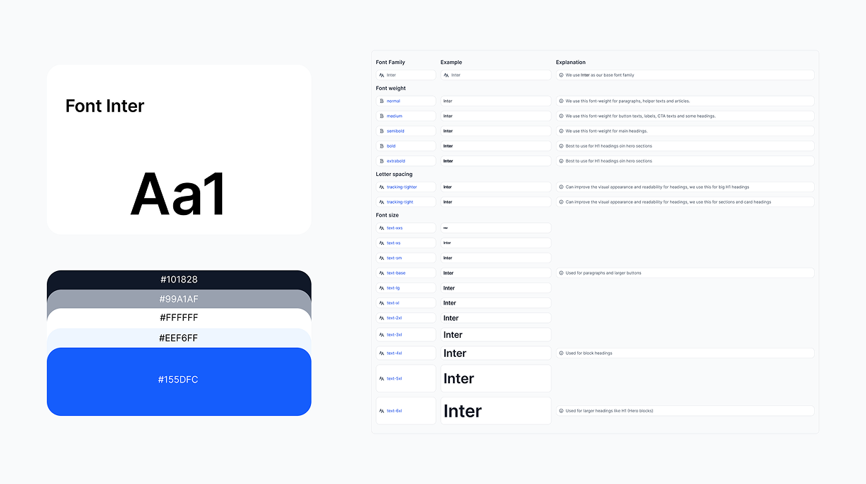
I designed and prototyped a clean visual system by setting up clear variables throughout each design step of the design system so that all volunteers across the team would be able to produce consistent screens — this ensures that both component rules and any additional testing training become second nature.
I designed and prototyped the check-in and check-out workflow for the Capitol Hill Tool Library system in Figma. I focused on creating a clear visual hierarchy that would guide volunteers through each step of the process, especially in a fast-paced environment. Instead of using bright or distracting elements, I prioritized clarity and readability by emphasizing primary actions and reducing unnecessary visual noise. This resulted in a more focused interface that helps users complete tasks quickly without feeling overwhelmed.