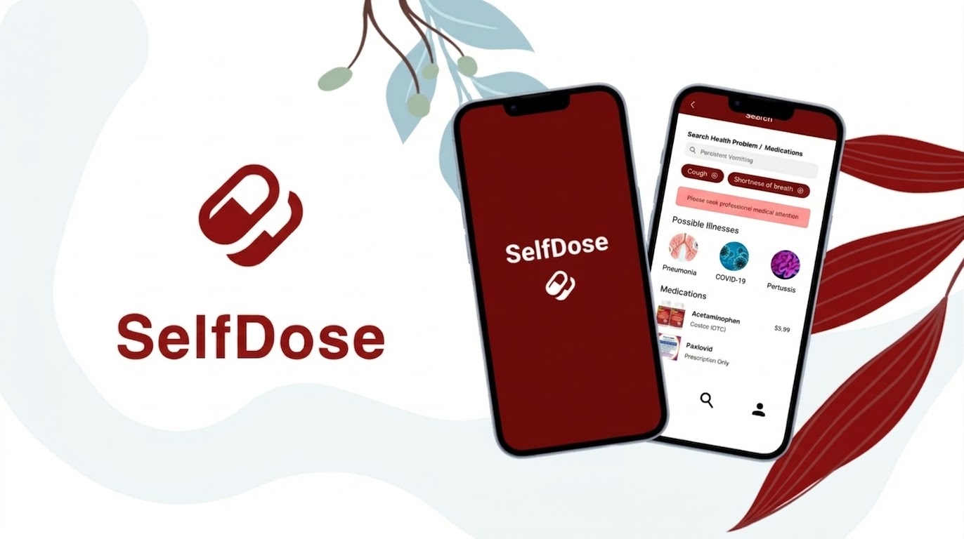
SelfDose is a healthcare-focused mobile app designed to help individuals and caregivers safely navigate self-medication. It provides clear, personalized guidance on symptoms, over-the-counter medications, and potential risks such as allergies or drug interactions.
SelfDose was inspired by problems I noticed working at a pharmacy. Self-medication is one of the most common forms of healthcare. People frequently manage symptoms like fever, headaches, coughs, and stomach pain without consulting a clinician. However, while OTC medications are easily accessible, safe use requires careful understanding of dosing, allergies, drug interactions, and symptom severity.
This is particularly challenging for:
Most existing tools provide fragmented or overly technical information, leaving users unsure whether a medication is safe.
People lack a reliable way to determine:
As a result, users often rely on quick internet searches or guesswork, which can lead to unsafe medication decisions.
To better understand how people currently navigate self-medication, I analyzed existing healthcare and medication apps including WebMD, Drugs.com, and Ada Health.
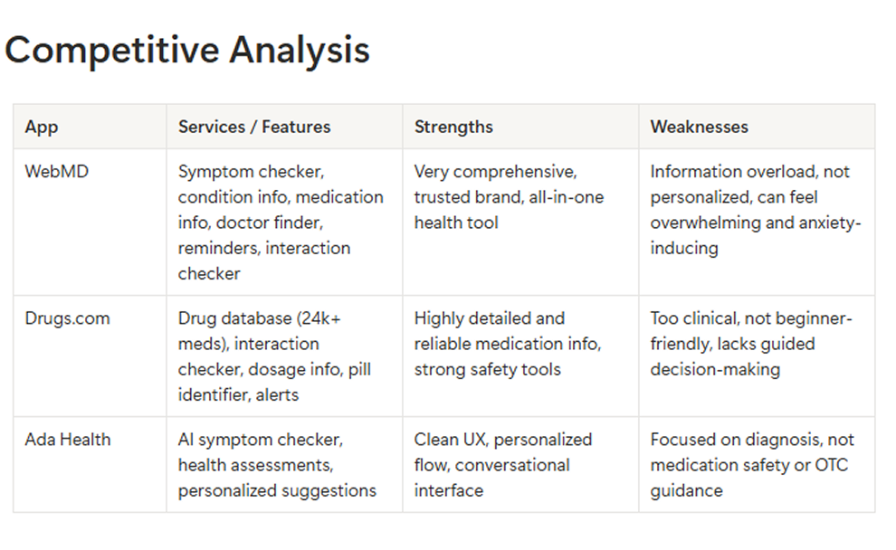
Platforms like WebMD and Drugs.com provide extensive medical information, but users are left to interpret it themselves. This can feel overwhelming, especially in stressful situations.
While some apps include drug interaction tools, they require manual input and medical knowledge. There is little support for automatically factoring in user-specific conditions like age, weight, or allergies.
Many platforms rely on dense medical language and cluttered interfaces, making them less accessible for everyday users or caregivers under pressure.
After studying and researching other symptom checker apps, I created wireframes that fill in the gaps of personalization, easy user flow, and a modern look.
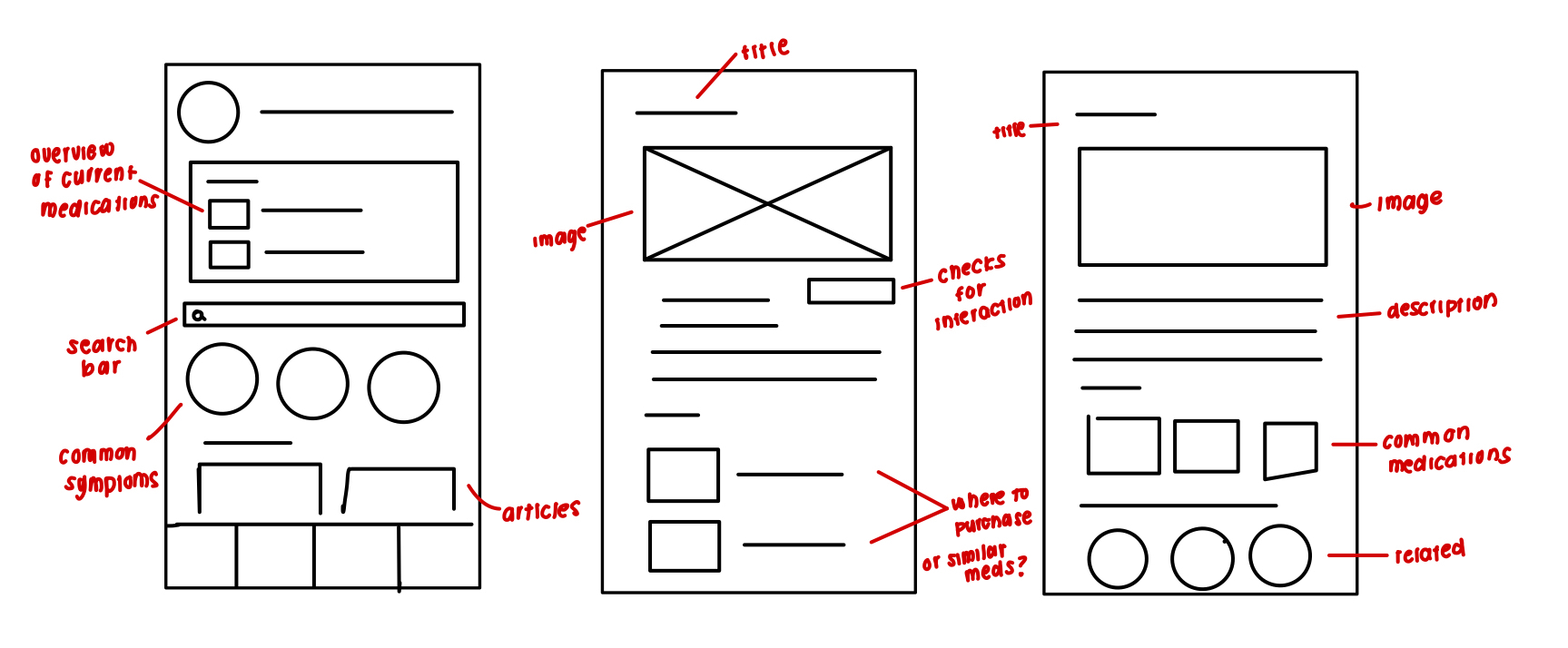
SelfDose simplifies self-medication by guiding users through safe, personalized decisions in real time. Based on research insights around confusion, lack of guidance, and safety concerns, I designed a system that transforms complex medical information into clear, actionable steps.
Users enter basic information such as height, weight, allergies, current conditions, and medications.
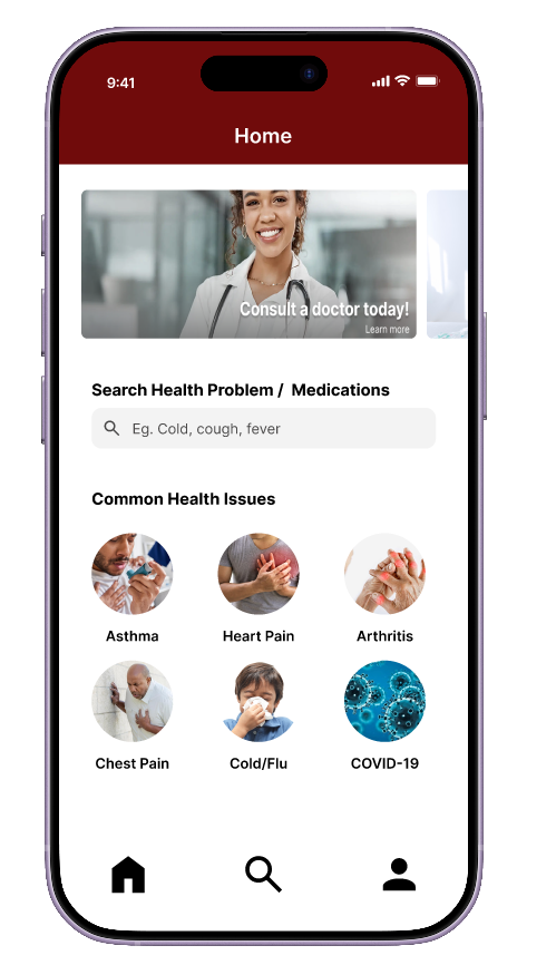
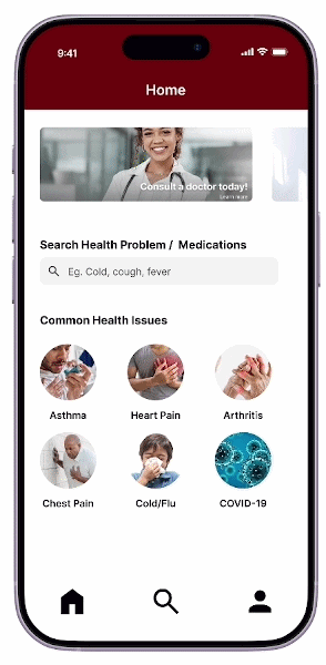
Home page provides quick access to symptom checking and medication history.
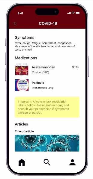
View and manage symptoms effortlessly. The checker guides users step by step, factoring in personal health history to surface safe, relevant recommendations.
Allows users to filter medications based on their health profile and real-time needs. This connects the gap between accessibility and safe self-care.
The design of SelfDose was guided by several core UX principles to ensure the interface is safe, understandable, and easy to use in moments when users may be stressed or unsure about their health decisions.
Every screen was evaluated against one question: could this cause harm if misunderstood? Medication warnings are never hidden in fine print, they interrupt the flow with a dedicated screen. The Symptom Explorer deliberately avoids surfacing diagnoses, instead routing users toward a pharmacist or physician. Safety wasn't a feature added at the end; it shaped the structure of every decision.
Users opening SelfDose are often unwell, stressed, or managing a chronic condition, not the ideal state for processing complex information. Progressive disclosure keeps onboarding simple by collecting only essential health information upfront. The Home Page surfaces the single most urgent action, a medication reminder, rather than presenting everything at once. Less to read, less to decide, fewer mistakes.
Health apps ask users to share deeply personal information. SelfDose earns that trust by being upfront, explaining why each piece of health data is collected, how it's used, and what the app can and cannot do. The Symptom Explorer clearly communicates it is not a diagnostic tool. Medication warnings tell users not just what the conflict is, but why it matters to them specifically. Transparency isn't just ethical here, it's what makes users feel safe enough to rely on the app.
A medication management app is only useful if everyone who needs it can use it, including elderly users, people managing chronic illness, and those with low health literacy. Type sizes, contrast ratios, and tap target sizes were designed to meet WCAG 2.1 AA standards. Medical terminology is written in plain language throughout, targeting a reading level that doesn't require a clinical background to understand.
Accessibility must be designed as a system, not added as a feature. Designing SelfDose required prioritizing clarity, predictability, and low cognitive load for users navigating health decisions under stress. Supporting safe self-medication workflows meant balancing comprehensive guidance with simplicity, ensuring that every interaction felt intuitive, trustworthy, and reassuring.